
在 SwiftUI 中,Picker 是一个非常常用的组件,用于选择多个选项中的一个(例如下拉菜单或滚轮选择器)。它支持文本、图像、复合视图等作为选项。
基本用法
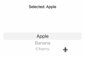
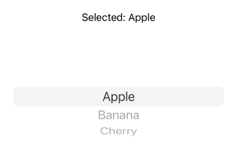
单选 Picker 示例
import SwiftUI
struct ContentView: View {
@State private var selectedOption = "Apple" // 默认选中值
let options = ["Apple", "Banana", "Cherry"]
var body: some View {
VStack {
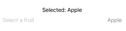
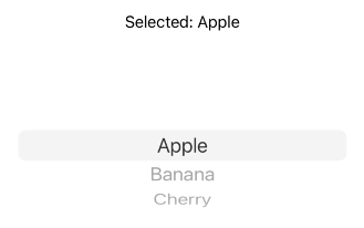
Text("Selected: \(selectedOption)")
Picker("Select a fruit", selection: $selectedOption) {
ForEach(options, id: \.self) { option in
Text(option).tag(option) // 设置标识符
}
}
.pickerStyle(.wheel) // 可选:选择样式
}
.padding()
}
}
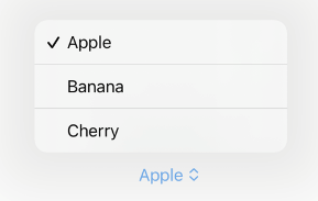
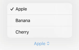
Picker 样式
SwiftUI 提供了多种 Picker 样式:
.automatic:自动选择样式(默认行为)
.inline:内联选择器样式
.menu:下拉菜单样式(适用于 iOS 和 macOS)
.navigationLink:单行选项
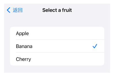
需要注意的是,需要配合NavigationStack才能使用. navigationLink选项。
.palette:选项以水平或网格布局显示。
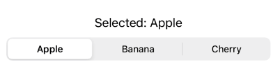
.segmented:分段选择器(类似 UISegmentedControl)

.wheel:滚轮选择器(适用于 iOS)
提示
部分样式(如 .palette)可能需要特定平台支持,例如在 Apple Watch 上更常见。如果在 iOS 中使用这些样式,需要注意平台差异和用户体验设计。
注意事项
1、隐藏Picker的文本信息
可以通过 .labelsHidden() 隐藏Picker的文本信息:
Picker("Select a fruit", selection: $selectedOption) {
    ForEach(options, id: \.self) { option in
        Text(option).tag(option)
    }
}
.pickerStyle(.wheel)
.labelsHidden()     // 隐藏文本信息,这里隐藏的是“Select a fruit”
2、macOS自动拉伸问题
在macOS上还会看到,Picker会默认拉伸来占据剩余空间(尤其是无 label 时)。
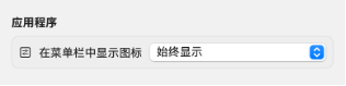
解决方案为:使用fixedSize限制容器的宽度。
Picker("", selection: $appStorage.displayMenuBarIcon) {
    Text("Always show").tag(true)
    Text("Off").tag(false)
}
.labelsHidden()
.fixedSize() // 不随容器拉伸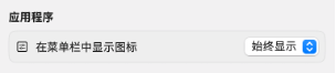
3、macOS无法自定义Picker样式问题
在macOS中,无法自定义Picker样式、颜色。
Picker("",selection: $appStorage.convertTypeState) {
    ForEach(ConversionTypeState.allCases) { option in
        Button(option.rawValue) {
            appStorage.convertTypeState = option
        }
        .tag(option)
    }
}
.buttonStyle(.plain)
.frame(width: 60, height: 30)
.foregroundColor(.white)
.background(Color(hex: "082A7C"))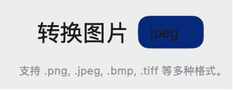
问题原因,在macOS上,SwiftUI 的 Picker 默认会渲染成 AppKit 的 NSPopUpButton,这是一个原生控件,系统会强制它用系统主题样式(浅色/深色模式下自动适配),所以:
.foregroundColor()、.background()、.cornerRadius() 这些修饰符对 Picker 的 label 区域几乎不起作用。
只能控制的菜单项(弹出后列表里的 Text)的颜色。
但是按钮本身(闭合状态下)会始终用系统风格。
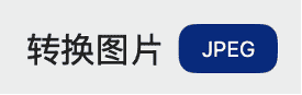
解决方案:替换为Menu。
Menu 在 macOS 上表现得更灵活,本质上等价于一个 MenuPickerStyle 的 Picker,但是样式可以完全自定义:
Menu {
    ForEach(ConversionTypeState.allCases) { option in
        Button(option.rawValue) {
            appStorage.convertTypeState = option
        }
    }
} label: {
    Text(appStorage.convertTypeState.rawValue.uppercased())
        .frame(width: 60, height: 30)
        .foregroundColor(.white)
        .background(Color(hex: "082A7C"))
        .cornerRadius(10)
}
4、Picker和onTapGesture存在冲突
如果外层视图使用onTapGesture手势,内部视图的Picker如果使用palette或者segmented样式,会造成无法识别点击手势的问题。
需要考虑移除外部的onTapGesture手势,或者使用其他的Picker样式。
总结
Picker可以实现多选项视图,适用于iOS和macOS等平台。


